Dozens of details can choke the efforts of an unfocused marketer or executive. How can you keep distractions and demands from derailing you? KPI dashboards can hold your existing projects on target. They can also give you space for new marketing initiatives and help you track your business performance.
How can you use this tool to raise your marketing to new heights?

What are KPI Dashboards?
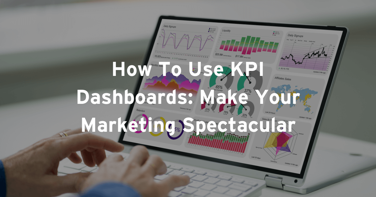
A KPI dashboard is a document that shows you visually, at a glance, how important parts of your business are performing. It uses metrics, or Key Performance Indicators (KPIs), that you choose for measuring your success. This dashboard could be made using Excel, PowerPoint, or some other software.
You’ll make better decisions when you have a dashboard like this, especially when it has the right level of detail.
Only include necessary details

Experience has proved that the best dashboards only show about 5 to 9 metrics, or KPIs. Add too many and you won’t be able to focus on what’s important.
Jim Collins, in his book Good to Great, emphasizes, “If you have more than three priorities, you have no priorities.” What are your three? What two or three factors can you use to measure the success of each priority? These are your 5 to 9 KPIs.
On an executive-level dashboard, return on investment or cost to acquire a customer will be far more important than Facebook likes. Focus only on metrics that are worthwhile.
Why are KPI Dashboards so powerful?

You should collect and manage all the data you can for your business, yet the summary needs to be simple. With the right overview, using exact, real-time data, you’ll be able to make superior business decisions.
What software options do you have?
Zoho offers an easy, drag-and-drop dashboard builder. They also make it easy to work with your dashboard on all your devices, including mobile. Hubspot offers several free features. Other options include Klipfolio, Geckoboard, and Databox, our personal favorite.
You can also find many free Excel and PowerPoint templates you can customize and make your own.
The steps to create KPI Dashboards
- Know your user. A CEO will need a far different dashboard than a customer support department.
- Keep it simple. Include all the vital information at a glance.
- Use only what’s needed. Don’t be tempted to display more details than necessary.
- Consult with your team. Decide which KPIs will help you reach your goals.
- Create a dashboard mockup. Choose the right visuals for the job. For example, line or column charts work best for trends. Pie charts are great for showing composite data, meaning parts that make up a whole.
- Select your dashboard software or tools.
- Connect your tools to real business data.
- Start creating visuals from your data.
- Deploy your dashboard and continue to get feedback.

Try to make one of the best KPI Dashboards
Data is vital to every successful business, so you need to get more value from your data. Building the best dashboard will ensure the right people understand your data.
This is how you can rally key company players, get the right people involved, and make better company decisions.
KPI Dashboards Examples
Most dashboards fall into 4 categories, based on their audience and purpose: executive, operational, tactical, and analytical.
Let’s say you’re making an executive dashboard with a financial focus. You might display year-to-date revenue as a gauge. Green or red lights accompany your Quick Ratio, Current Ratio, and Debt-Equity numbers.
You could show your financial performance as a vertical bar chart, using colors for each business division. You might present short-term assets, like cash, investments, and accounts receivable as a stacked vertical graph.
Here’s another dashboard example with revenue goals:

A customer support department might use an operational dashboard to track call volume and location.
Their dashboard could have a big number showing the number of calls in the last week. A heat map might use colors to show which areas placed the most calls. Bar charts could show how many calls per hour you get, and pie charts could show each type of call you’re measuring.
Tactical dashboards are also useful for department-level details. You can show numbers and percentages in red or green, depending on whether the value is positive or an issue.

For the marketing department in an e-commerce business, your dashboard might show the average shopping cart value, the total amount purchased, the value of abandoned carts, the number of sessions, and how many visitors you have. A line chart depicting the number of sessions each day for the last month could also be useful.
Analytical dashboards dive deeper into the data. Middle management and analysts use these to assist executives.
Data analytics goals vary greatly. Besides marketing KPIs, you might forecast growth, show metrics to improve your customer service, or even use historical data to find trends.
How often should KPIs be reviewed?

You’ll want to review your data regularly – weekly, monthly, even daily – depending on what you’re measuring.
When you see something unexpected, get others involved. Work to find out the cause of the anomaly. Don’t be afraid to experiment.
Did you fall short of reaching a goal? What else can you include on your dashboard to help you reach your new goal?
However, always make changes slowly to your dashboard. If you change too quickly, you won’t be able to tie your results to the changes you made.
What does this all mean for you?
Winning companies promote a data-driven culture. This means everyone is involved in and excited about collecting, interpreting, and using data to make better decisions.
Stay on track by using your KPI dashboards often. They are the compass guiding you toward achieving your marketing goals.


