When that doesn’t happen, traffic stalls, bounce rates climb, and leads slip through the cracks. Most businesses respond by spending more on ads, but driving people to an underperforming site just multiplies the waste.
Before applying fixes, it’s worth stepping back to understand why the conversion rate has slowed down in the first place. This first section covers the most common breakdowns—and how to spot them.
Define the Action You Want
Conversions aren’t always about sales. A conversion happens any time a visitor takes a step forward, whether it’s requesting a quote, joining a list, or downloading a resource. Some actions indicate purchase intent. Others show early interest. Both matter.
A clear understanding of your primary and secondary conversion goals will shape the rest of your site strategy. Vague outcomes like “more engagement” often lead to vague designs and underwhelming results.

Misaligned Traffic Wastes Time and Money
Too often, the right visitor never makes it to the site—and the wrong one bounces in under ten seconds. This happens when ad targeting is too broad, content doesn’t reflect the offer, or SEO keywords pull in casual browsers instead of qualified leads.
Here’s a snapshot of what certain behaviors might reveal:
| Visitor Behavior | What It Suggests |
|---|---|
| Quick exits | Visitors expected something different |
| No interaction | Nothing on the page felt relevant |
| No page depth | No clear path or reason to keep exploring |
If your analytics show plenty of sessions but no form fills, the problem likely starts before the page even loads. Revisit your traffic sources and make sure your messaging sets the right expectations before the click.

Vague Copy Undercuts Trust
The first few sentences on a homepage set the tone. Confusing language, bloated mission statements, or industry jargon all create friction. A visitor shouldn’t need to scroll or guess to understand who the business serves and what outcome they offer.
Clarity leads to momentum. Unclear messaging, on the other hand, causes hesitation—and hesitation kills conversion.
Rather than asking, “How can we sound clever?” a better prompt is, “How can we sound obvious and helpful to the right person?”
Poor User Experience Breaks the Flow
Design plays a critical role in how visitors move through a site. When navigation feels clunky, forms take too long to complete, or mobile layout breaks down, people give up. It’s not because they don’t care—it’s because they’re busy and the site slowed them down.
Even small details add up. A blurry CTA button, a form that won’t submit, or a carousel that hides key info can derail what would have been a strong lead.
Watch for these common weak points:
- Page load times over 3 seconds
- Layouts that shift or overlap on mobile
- Menus with more than 6 choices
- Calls-to-action that blend in or say nothing
None of these problems are dramatic. That’s what makes them easy to miss—and dangerous to ignore.
Calls-to-Action Need Direction, Not Decoration
Every page should point the visitor somewhere useful. When buttons are vague (“Submit”) or overly generic (“Click Here”), they invite hesitation. Visitors want to know what happens next. They’re not looking for surprises.
Good CTAs offer clarity. They stand out visually, they repeat naturally through the page, and they reflect the visitor’s actual mindset. A pop-up that says “Sign up now!” might work for a warm lead, but most people need a little more context.
Here’s a test: if the call-to-action feels like something a competitor could copy and paste onto their own site, it’s probably not specific enough.
No Lead Capture Plan Means No Second Chances
Even the best pitch won’t convert every visitor on the first visit. Most people need time, reminders, or additional information. Without a plan to stay connected, those visitors leave—and you lose the opportunity to earn trust over time.
A thoughtful lead capture system creates those second chances. It could be an email signup with a valuable incentive. It could be a downloadable checklist or tool tied to your core service. It might even be a low-friction quiz or free consultation prompt.
What matters is that you’re offering something in return for their attention—not demanding it.
Most Conversion Problems Start Small
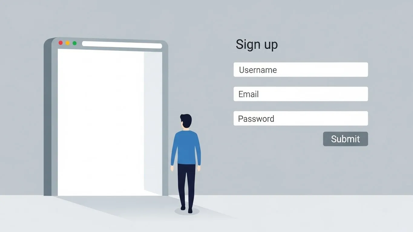
When a website underperforms, the issue rarely comes from one glaring flaw. Most of the time, it’s a collection of small missteps—a few mismatched ads, a couple unclear headlines, a slightly clunky mobile layout. These pieces feel harmless on their own, but together they create a dead-end experience.
Low conversion rates don’t always mean something’s broken. More often, the structure of the site just isn’t aligned with how people make decisions. Every visitor arrives with a question. If the website doesn’t help them answer it—and then show them how to take the next step—they’ll leave, even if they were interested.
This outlines key adjustments that help you guide more people from interest to action.
Give Every Offer Its Own Landing Page
A homepage has too many jobs. It tries to welcome everyone, support SEO, reflect the brand, explain services, and create trust—all in one place. That’s a tall order, and it rarely works well as a conversion tool.
Instead, build focused landing pages for each offer or campaign. A visitor who clicks on an ad for a free flooring estimate shouldn’t have to hunt through service menus or scroll past unrelated content. A clean page with a headline, short explanation, and single call-to-action gets far better results.
Each landing page should include:
- A clear and relevant headline
- A quick explanation (1–2 short paragraphs)
- One action, not a menu of choices
When possible, remove distractions like sidebars or extra navigation. If the page’s only job is to generate leads, treat it like a one-question conversation: “Do you want this service?” If the answer’s yes, make it easy to say so.
Shorten the Distance to Conversion
Visitors shouldn’t have to work hard to act. Long forms, multi-step menus, or overly complicated booking tools don’t signal professionalism—they signal friction.
Ask for only the information you truly need. For many local service businesses, name, phone, email, and zip code are enough to get started. You can always follow up to qualify the lead more deeply.
Avoid creating barriers like account creation or unnecessary confirmation steps. If you’re offering a free quote, say that upfront—and mean it. The fewer hoops, the more leads.
Place Calls-to-Action Where They’re Expected
Not everyone scrolls to the bottom. Not everyone reads the headline. Not everyone is at the same stage in the decision-making process. That’s why repeating your call-to-action in strategic locations makes a difference.
The rule of three works well here: once near the top, once in the middle, and once at the end. This keeps the next step visible no matter how far the visitor goes. Keep the button consistent in wording and appearance. If your primary action is “Book Your Free Estimate,” don’t mix in variations like “Start Here” or “Learn More.” Consistency reinforces clarity.
Also, make sure your CTA looks like something that can be clicked. That sounds obvious, but many sites use ghost buttons or underlined text that blend into the page. If you’re asking for action, design for action.
Offer Value Before Asking for a Commitment
Most people don’t convert because they’re not ready yet. That’s not a rejection—it’s a delay. Smart websites create space for that delay by offering something helpful in return for contact info.
Lead magnets work especially well here. These can be checklists, guides, or planning tools that speak to a real need. For example, a flooring business might offer a “Room-by-Room Budgeting Guide” for home renovations. A mattress retailer might share a “Sleep Quality Checklist.”
Even a single useful resource can double your lead volume over time. When visitors feel like they’ve received value first, they’re more open to staying in the conversation.
Rebuild Trust with Real-World Proof
Most people won’t believe what you say about your business—until they see what someone else says. That’s where testimonials, reviews, and recognizable logos come in. These pieces reduce hesitation and provide social context.
Instead of flooding your site with reviews, select two or three short ones with names, photos, or locations when possible. A quick quote like “They handled everything quickly and professionally—exactly what we needed,” does more than a generic five-star graphic.
Other signals like “Established in 1998,” or “Serving over 1,200 homeowners” help set the stage. You don’t need a fancy “trust badge.” Just use real facts to show visitors they’re not the first to walk this path.

Follow Up When They Don’t Convert Right Away
Someone visited. They clicked around. Maybe they even started a form—and then left. That moment isn’t a loss if you have systems to re-engage.
Simple automation makes this easier than it sounds. You can:
- Retarget ad traffic based on specific page views
- Send a short follow-up sequence after someone downloads a guide
- Offer a live chat prompt when a visitor returns for a second visit
Even one automated touchpoint can bring people back into the funnel. The key is to treat the first visit as part of a longer process, not a make-or-break moment.
Pay Attention to How People Actually Use the Site
Assumptions lead to wasted time. Tools like GA4, Hotjar, or Microsoft Clarity let you see how people interact with your pages in real time—where they scroll, where they pause, and where they drop off.
Start by checking your most visited pages. If the heatmap shows visitors skipping over your main selling point, move it higher. If they keep clicking a non-interactive image, turn it into a CTA. These adjustments are small, but the cumulative effect is real.
Website optimization isn’t about massive redesigns. It’s about noticing the places where your site quietly loses people—and gently fixing those places one by one.
Better Flow = Better Results
Strong websites don’t just look good. They guide. They make decisions easier, not harder. They respect attention spans and reward curiosity with clarity.
A steady stream of visitors means your site is getting attention—but attention alone won’t grow your business. If people are showing up but not taking action, there’s something in the experience that’s getting in the way. Maybe it’s messaging that doesn’t land. Maybe the form’s too long. Or maybe there’s nothing on the page that makes the next step feel worthwhile.
Conversions happen when a site removes friction, answers key questions, and makes forward movement feel easy. Let’s bring everything together with a recap and a focused checklist to help you identify what’s working—and what’s holding things back.
Where Conversions Break Down
Most underperforming websites have a few common trouble spots. You’ve probably seen at least one of these in your own analytics or heatmaps:
- Ads or search results bring in the wrong traffic, and visitors bounce quickly.
- The headline doesn’t clearly communicate what the business does.
- Forms ask for too much information or break on mobile.
- Trust elements like reviews or certifications are hard to find.
- There’s no follow-up plan for people who don’t convert on the first visit.
Any one of these can stall a visitor. Stack two or three together, and momentum stops entirely.
A Smarter Way to Audit Your Site
You don’t need a 50-point inspection. You need a short, focused checklist that reveals where things go quiet.
1. Is the message clear—fast? Skim your homepage. Can a new visitor figure out what you offer and who it’s for without scrolling? If the headline needs context to make sense, start there.
2. Are CTAs easy to spot and act on? Look for clear buttons—not just links. Do they stand out visually? Do they appear in at least two locations on key pages?
3. Can someone reach out in under 30 seconds? Test the main form on your phone. If it’s long, buggy, or buried, you’re losing leads.
4. Do you give value to those not ready to book? A guide, checklist, calculator, or short email series can keep the conversation going. Without it, hesitant visitors leave without a trace.
5. Is trust baked into the design—not buried? Place reviews, testimonials, or credentials near the action points. People want to feel confident before they commit.
Don’t Confuse Design With Direction
A clean layout helps, but it’s the structure behind the layout that drives results. If your site looks good but doesn’t nudge visitors forward, conversion won’t happen. Instead of tweaking fonts and colors, start with the flow. Make the path obvious. Make the offer relevant. Make it easy to say yes.
And then test. Tools like Hotjar, GA4, and Clarity can show you what visitors are actually doing—not just what you hope they’re doing. Small shifts based on real behavior often outperform major redesigns.
What Happens Next
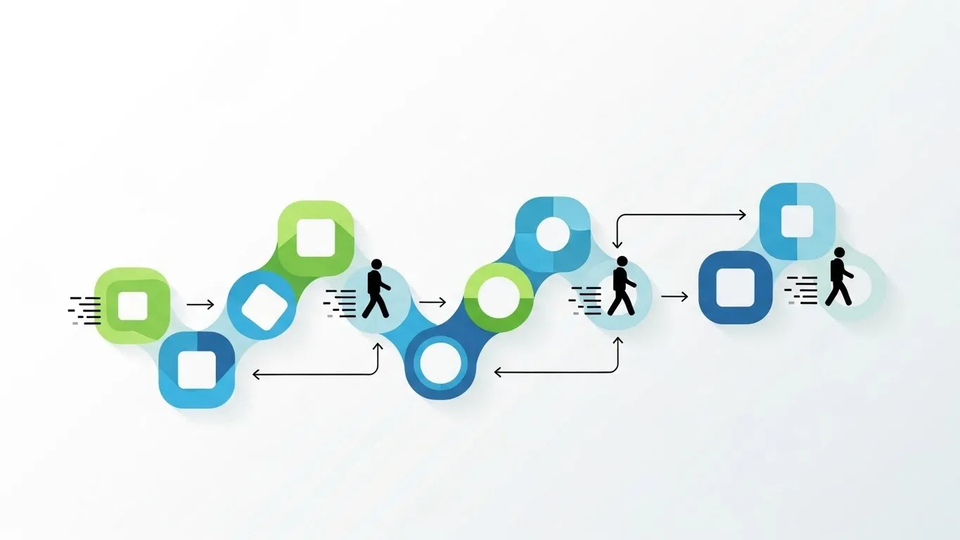
You don’t need to fix everything at once. Start with clarity. Tighten your message. Then simplify your forms, elevate your CTAs, and add one useful lead capture asset. Track what changes. Adjust. Then keep going.
If you’ve done all of that and things still feel stuck, you might just be too close to see what’s off. That’s where outside help can make the difference. A fresh set of eyes can spot missed signals, fix friction points, and turn casual traffic into qualified leads.
At First Direct, we specialize in making websites more than just digital brochures. We turn them into systems that engage, guide, and convert.
If you’d like an audit, a second opinion, or just a practical action plan—reach out. We’re here to help.